
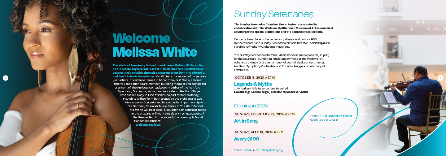
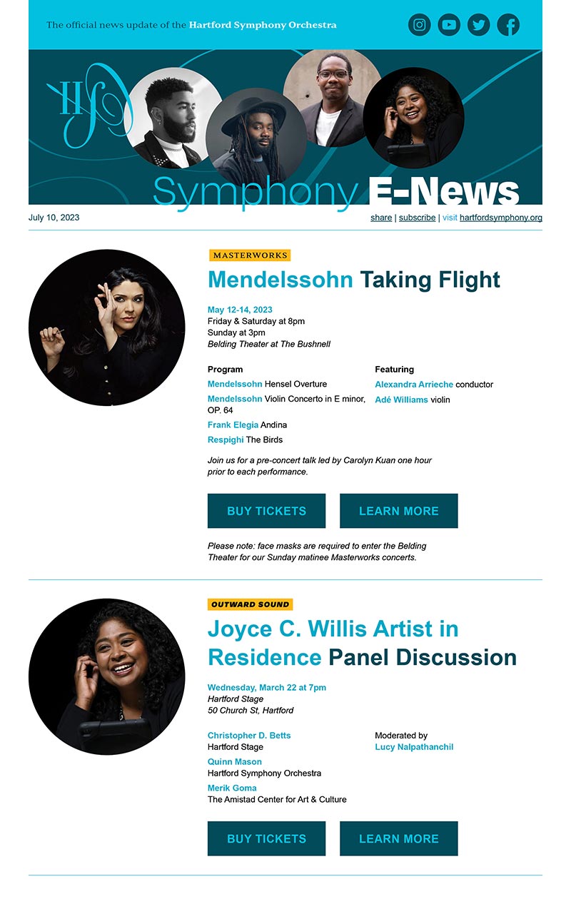
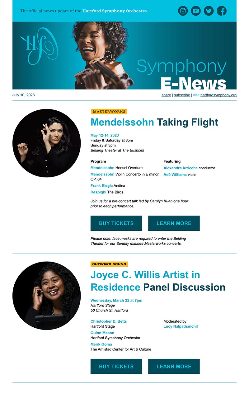
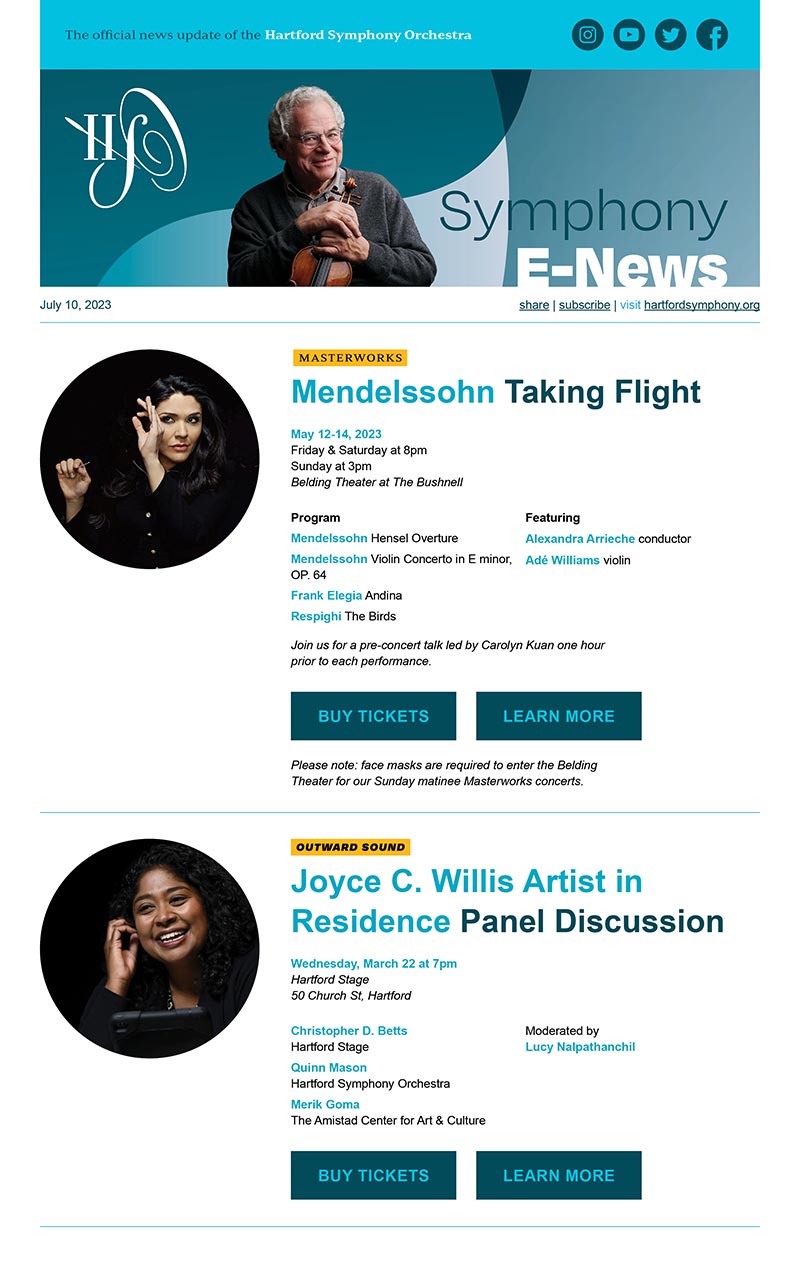
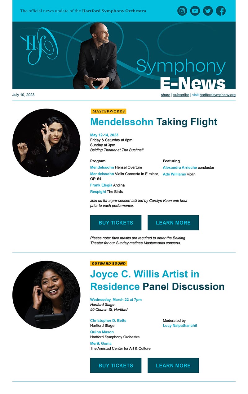
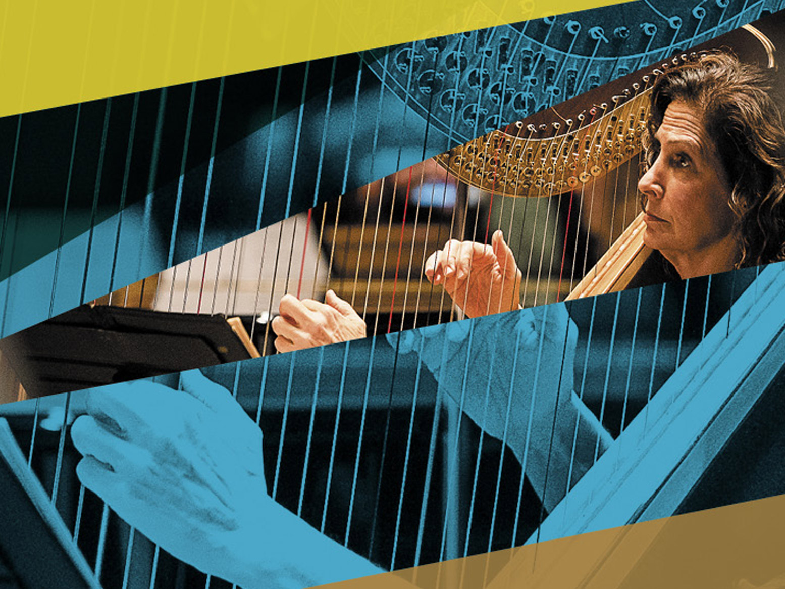
Hartford Symphony Orchestra
Elevated, engaging, and exciting—for everyone
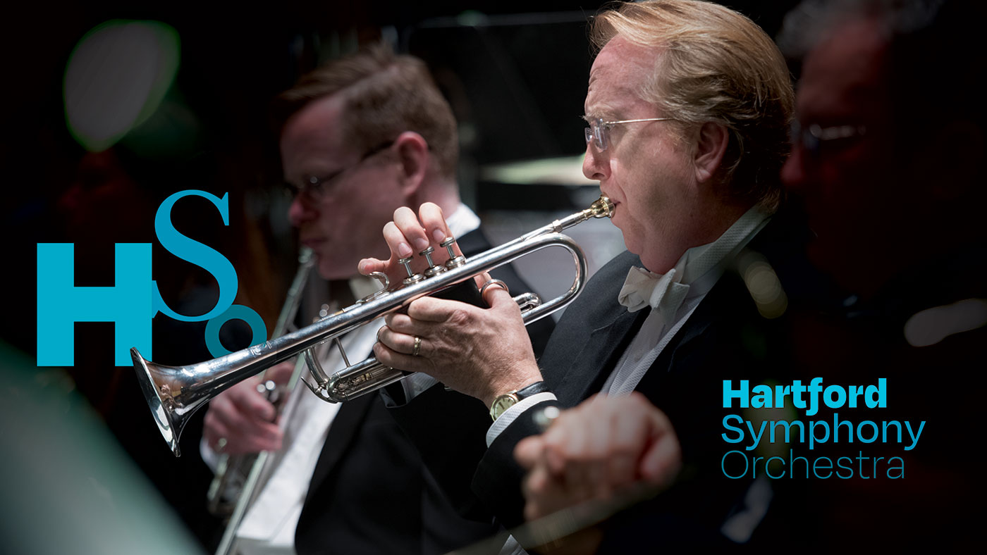
The HSO’s new brand communicates the energy of the organization’s ground-breaking maestro and active involvement across Hartford’s diverse communities while paying homage to a rich history of excellence in classical cannon.
ROLE
Creative Director/Designer
SCOPE
Strategy // Branding // Print // Web

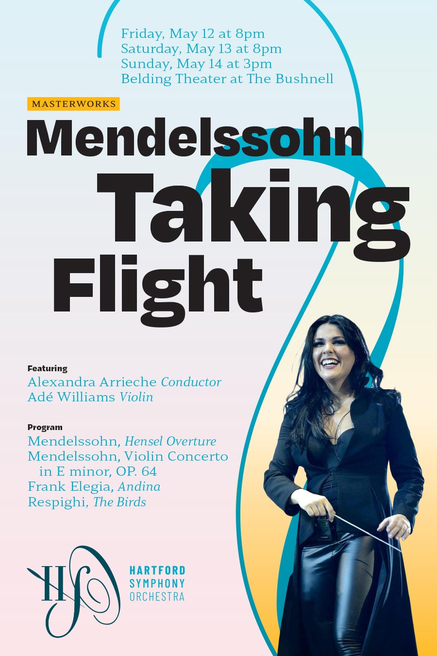
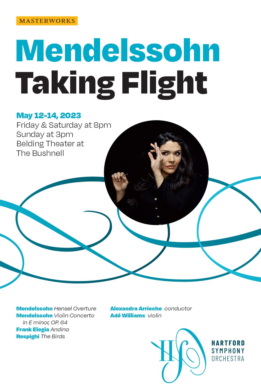
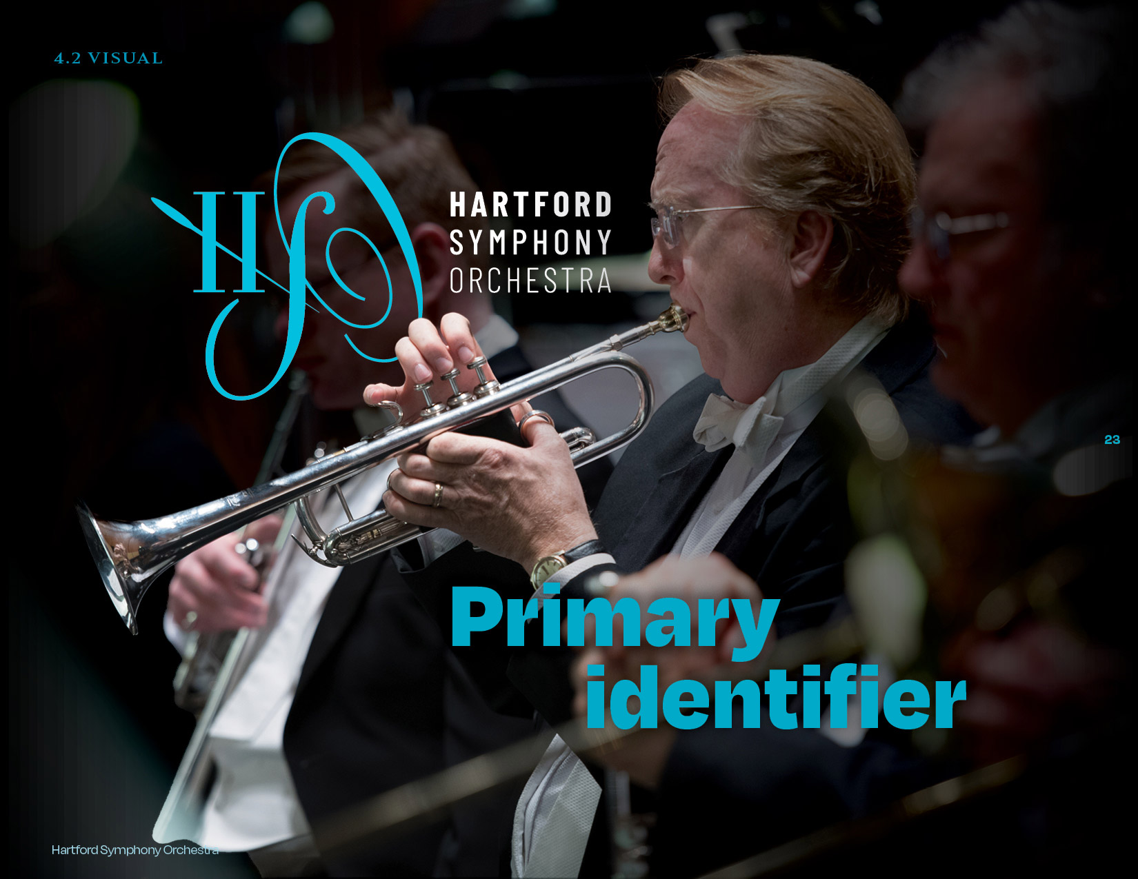
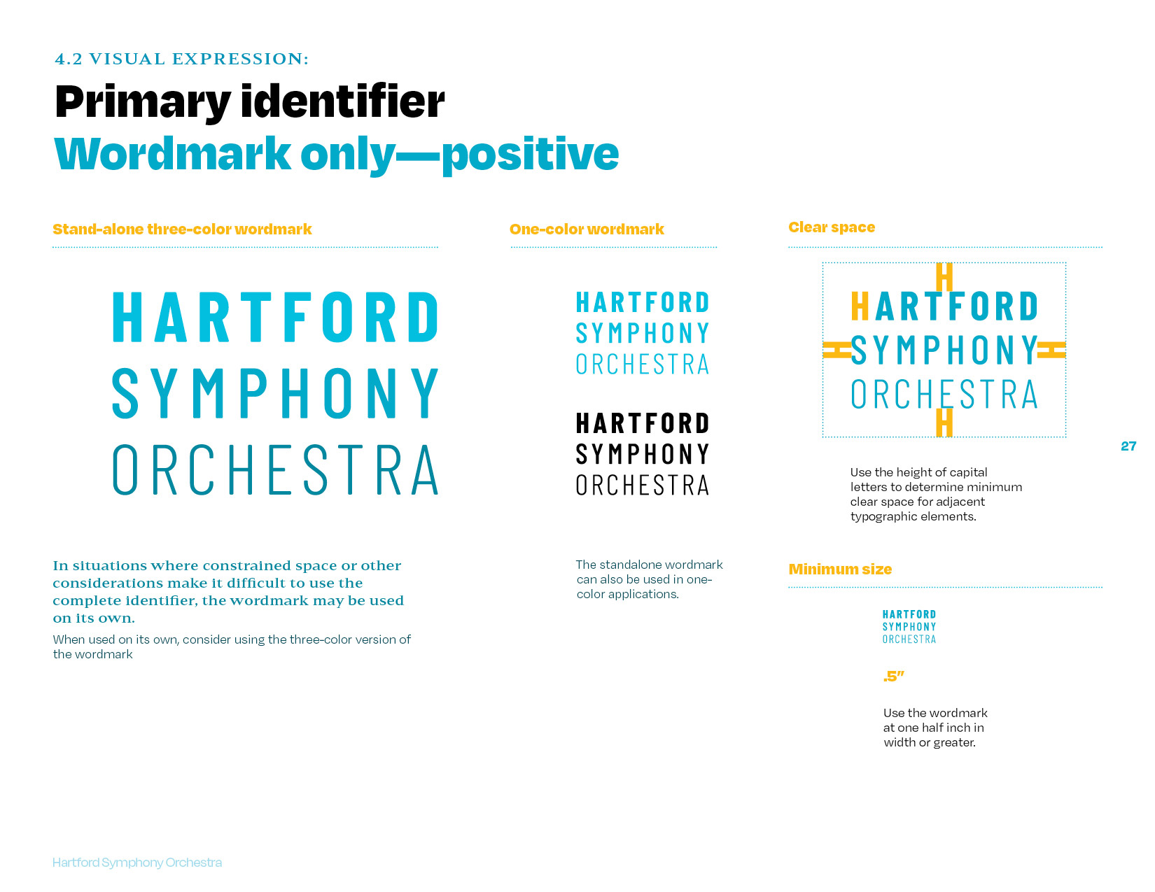
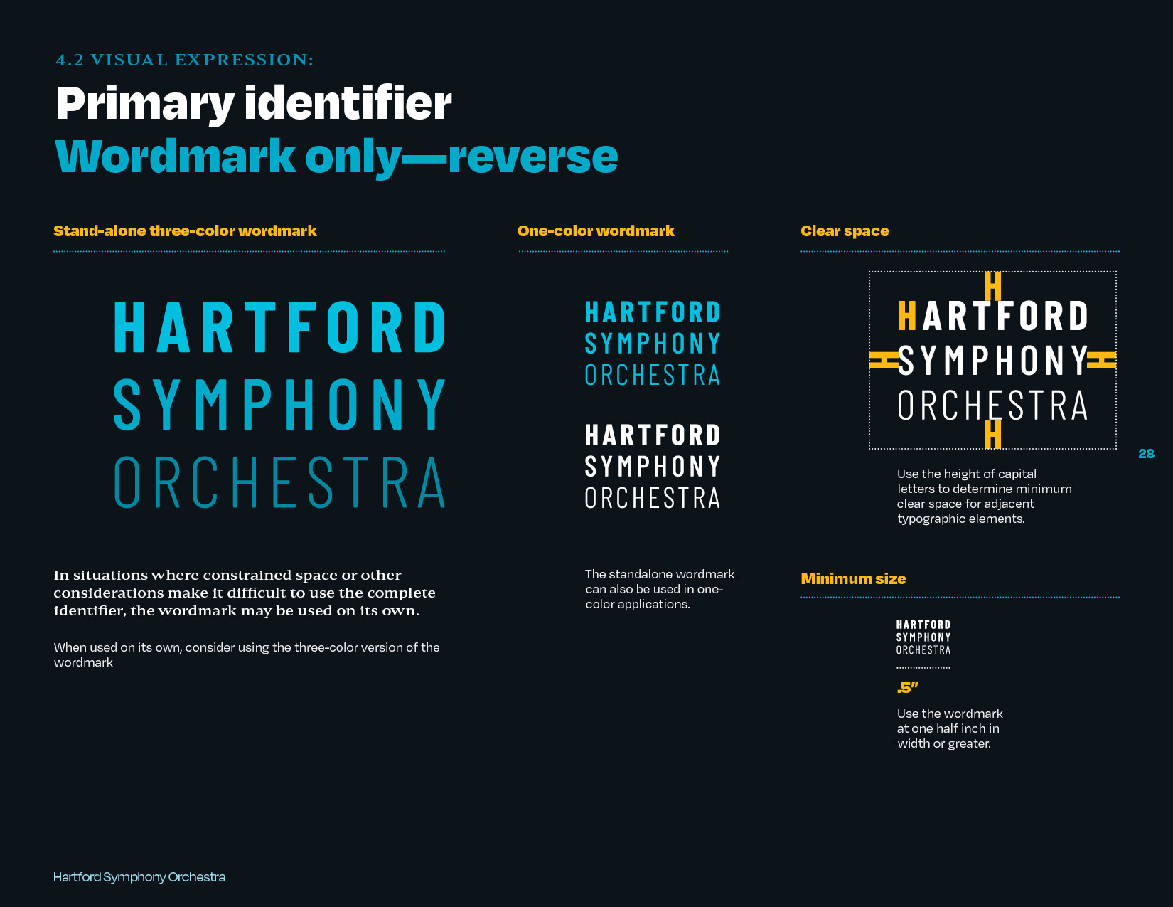
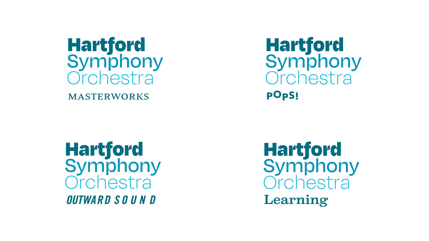
The revised Hartford Symphony Orchestra wordmark compliments the existing monogram, adding a more contemporary vibe while bringing forward existing brand equity.
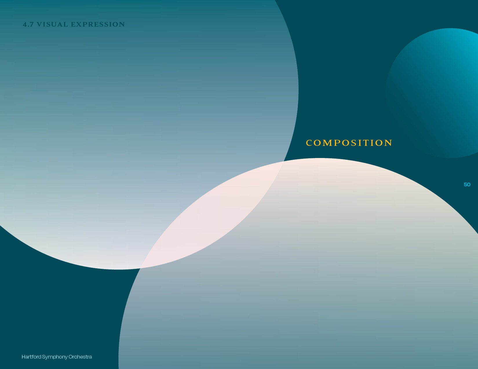
defining the system
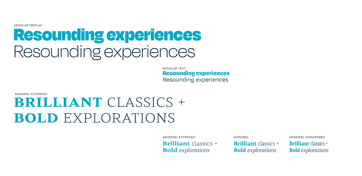


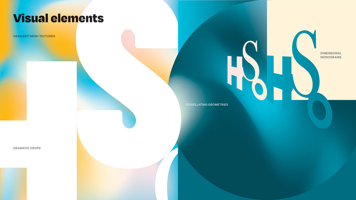
Building blocks
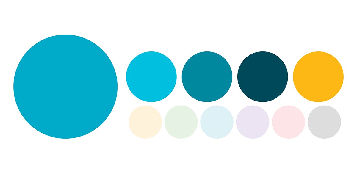
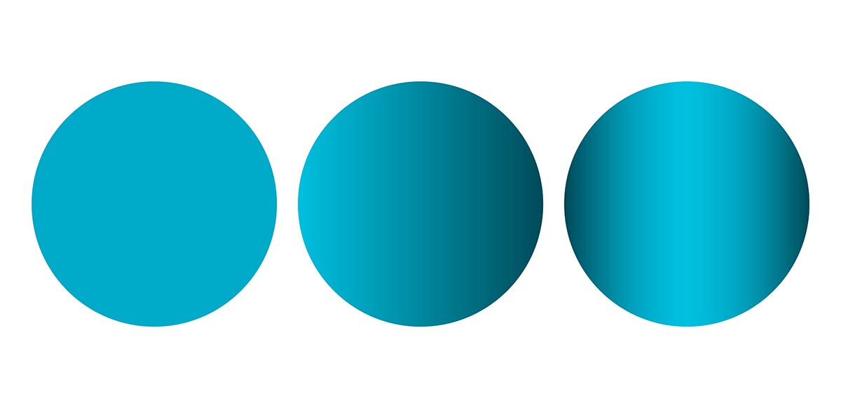
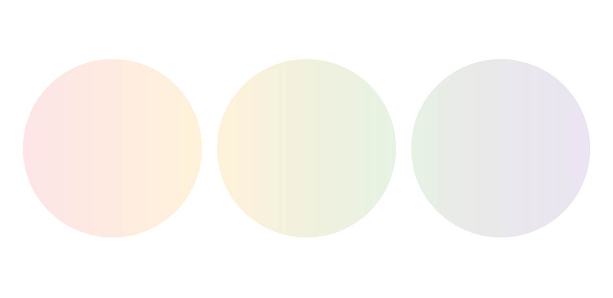
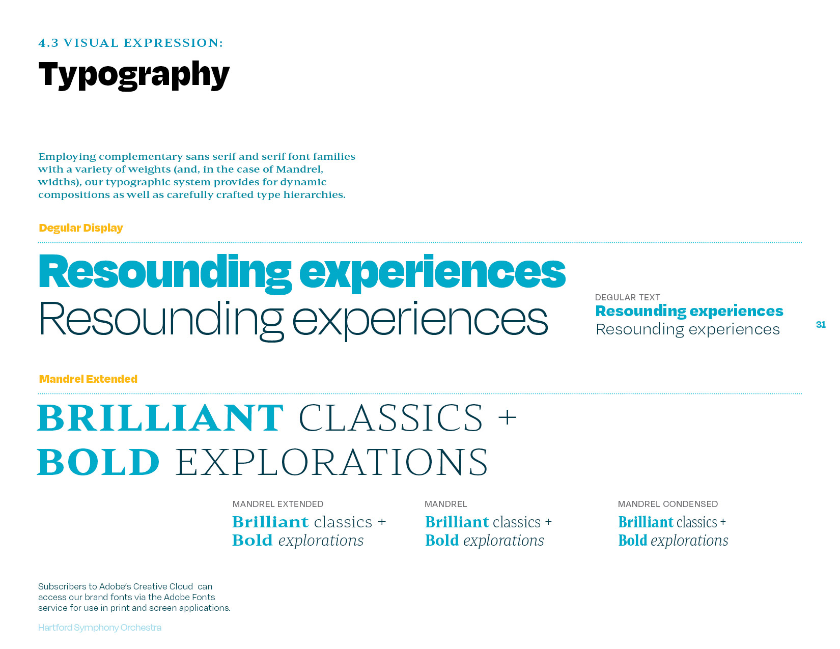
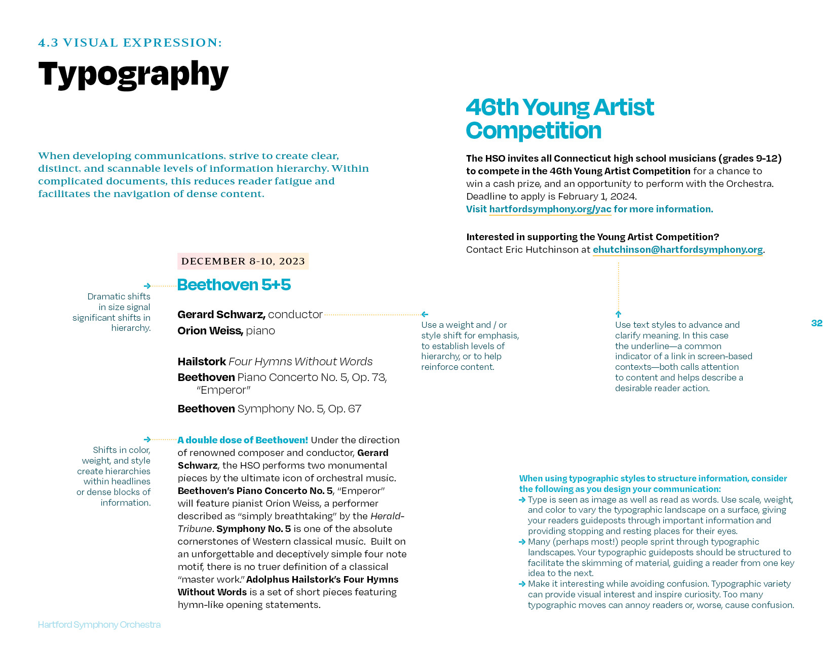
Flexible approaches to type, color, image, and graphic elements come together to define a recognizable, unique aesthetic.
System development

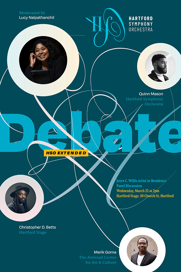
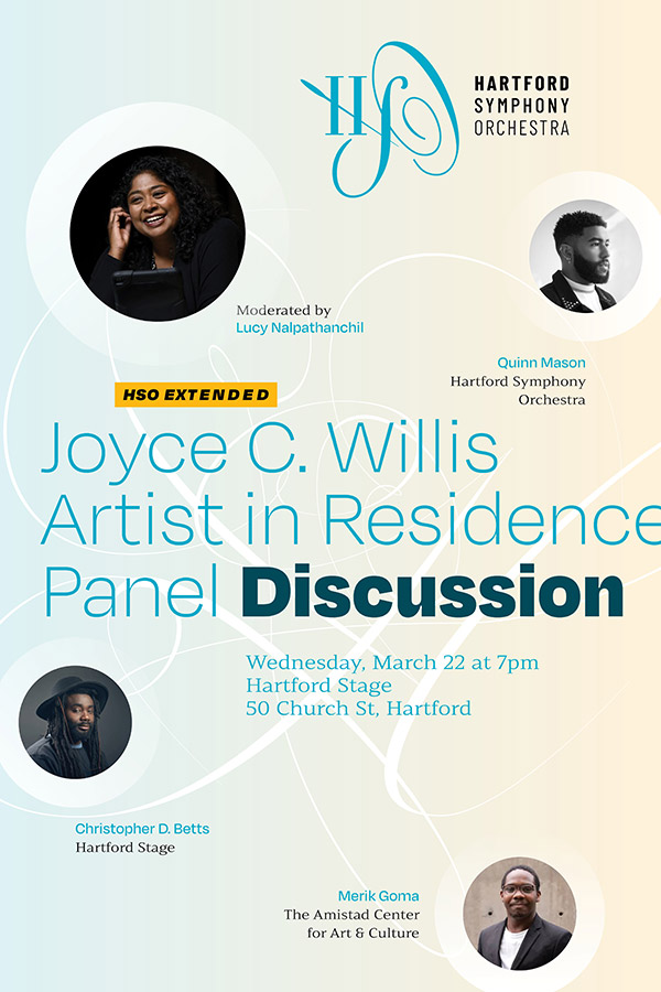
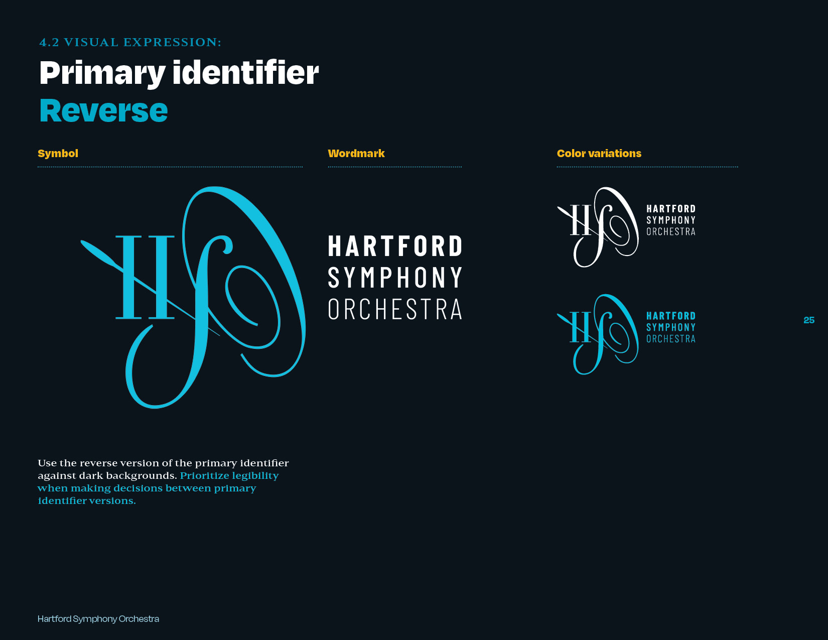
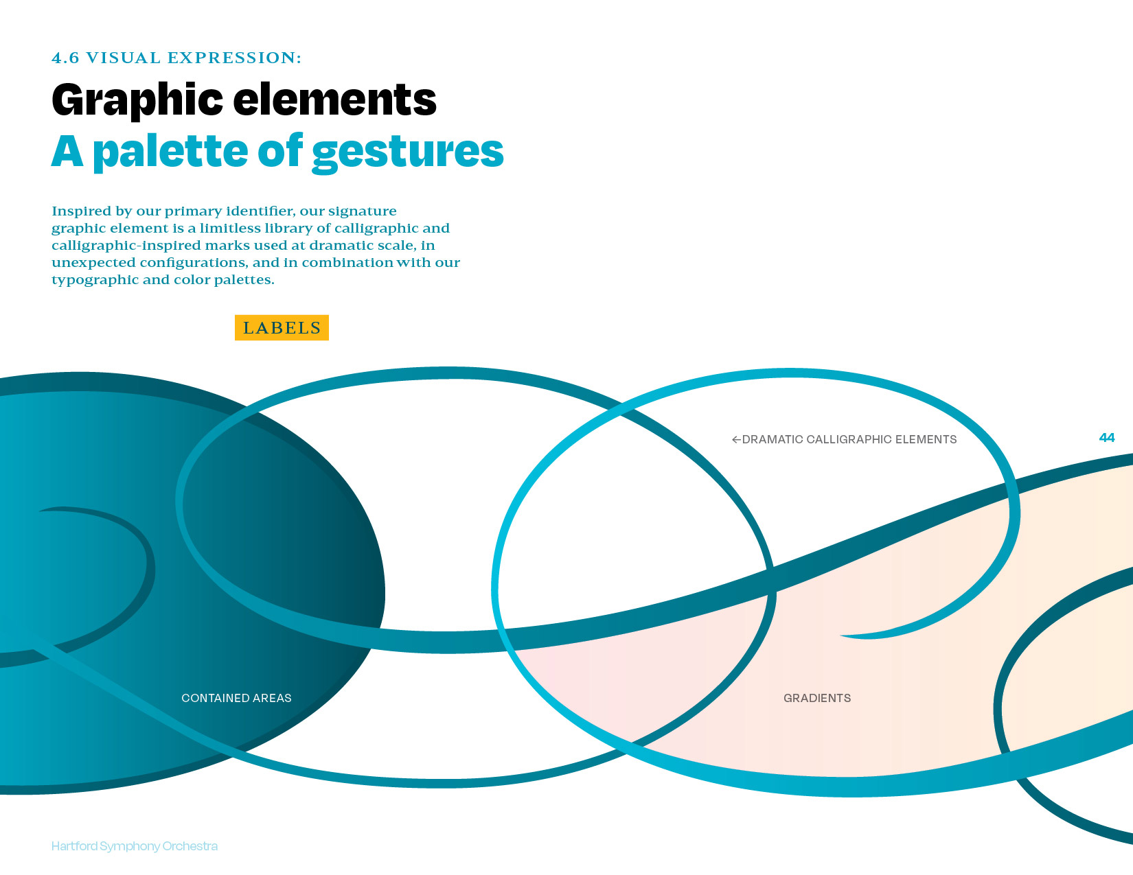
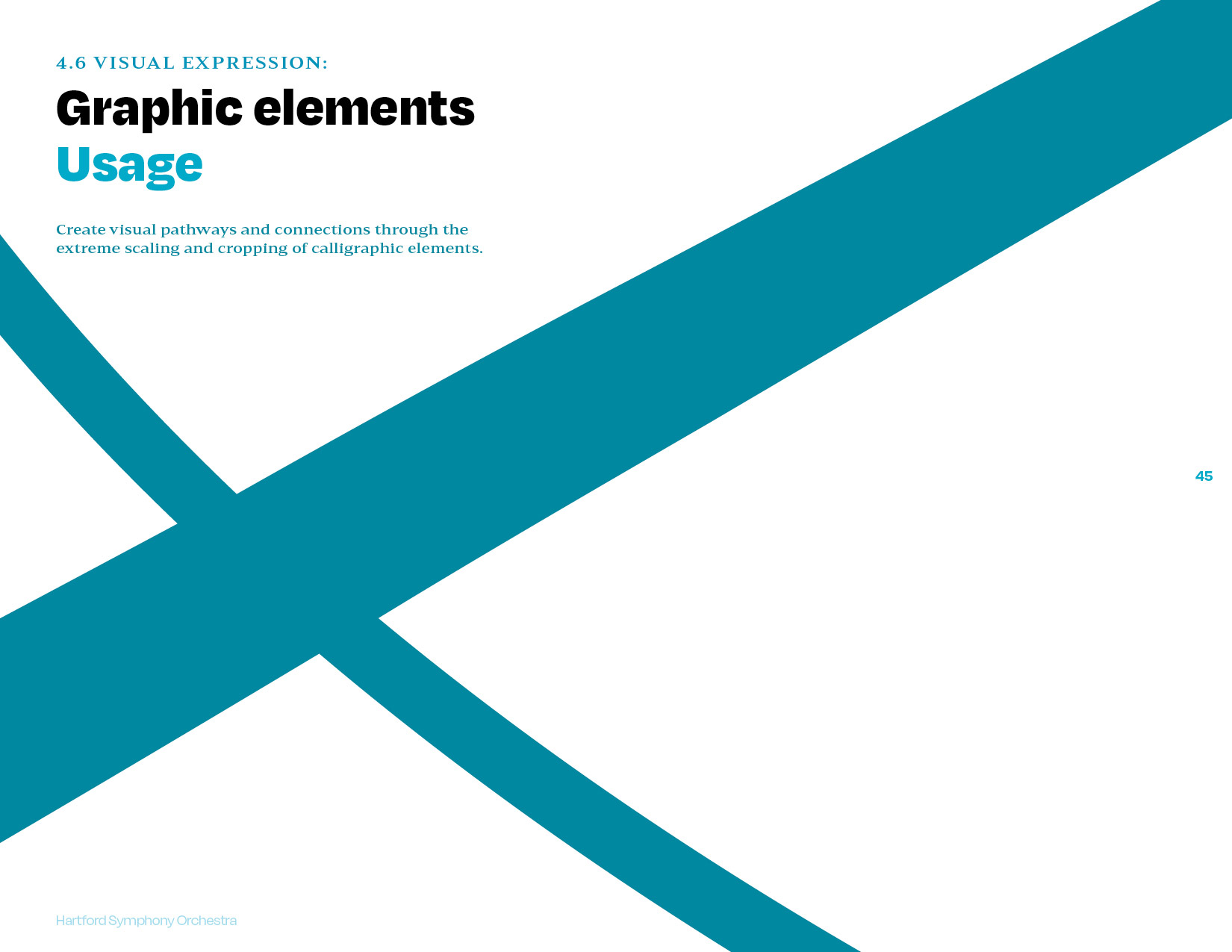
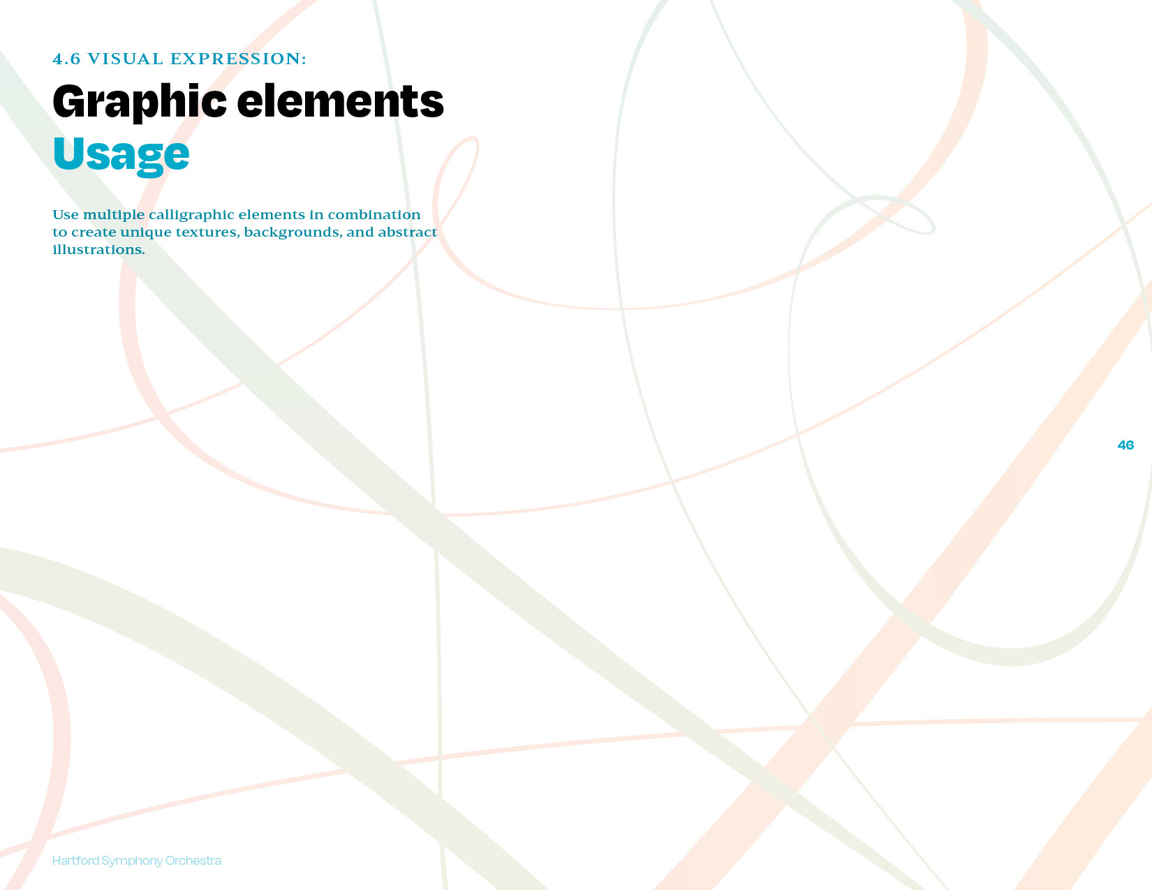
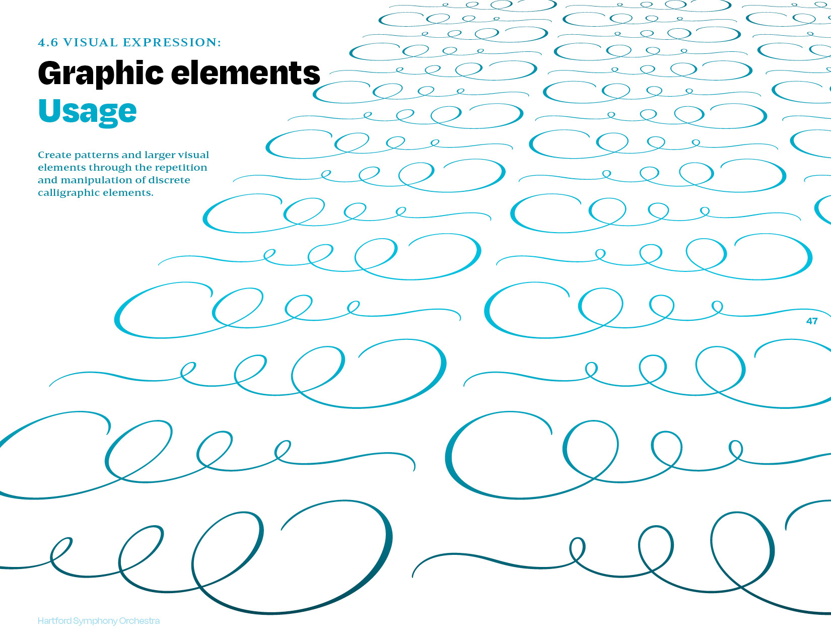
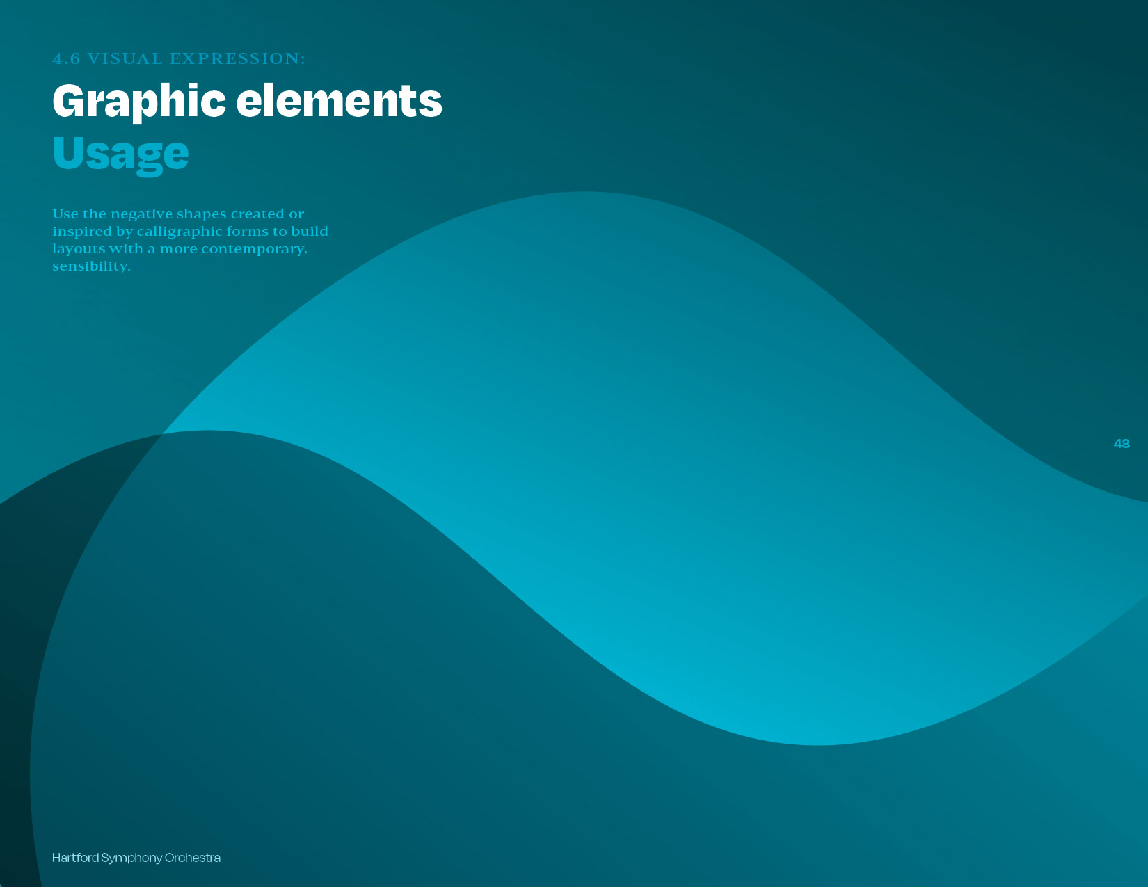
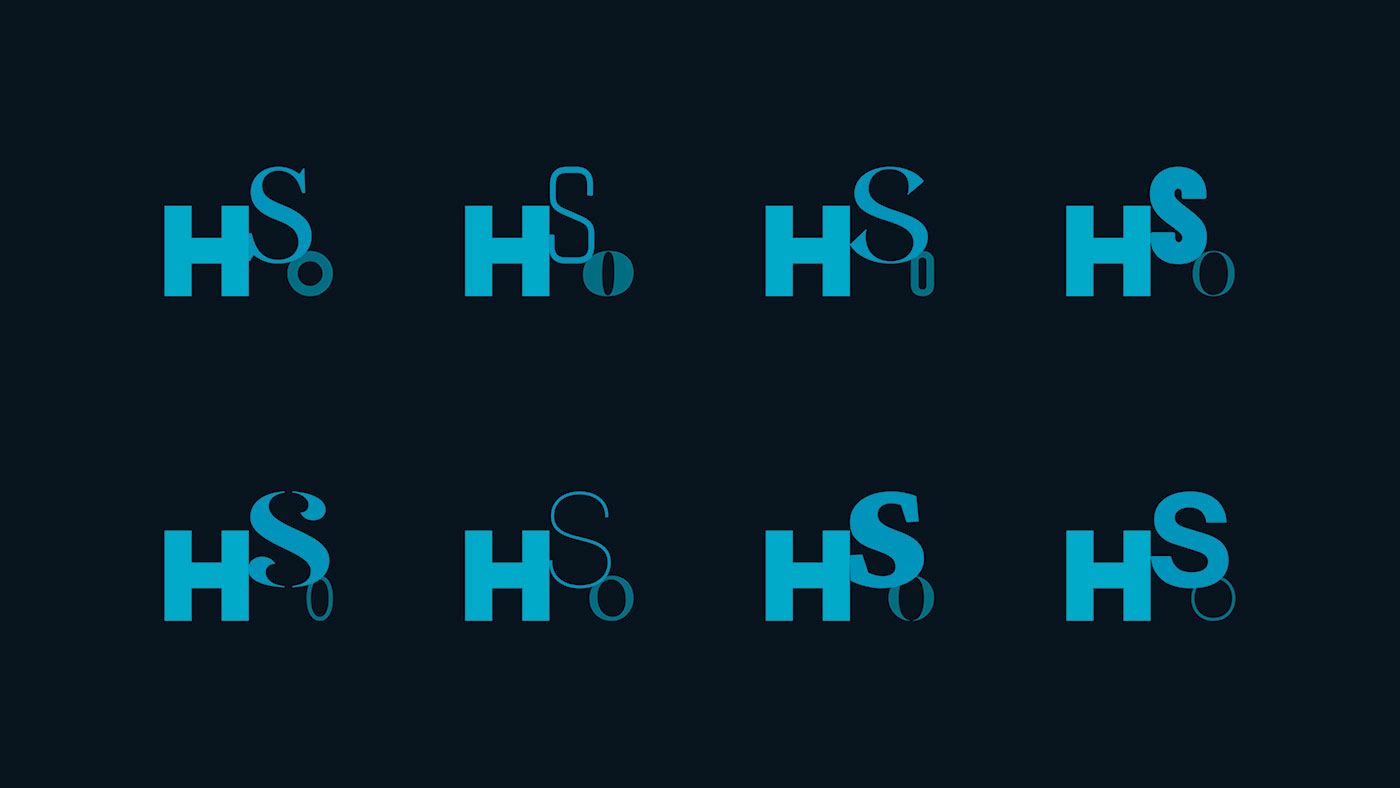
Rather than dispense with the existing calligraphic monogram, we decided to mine it for meaning and visual potential. We built on existing brand equity to evolve a dynamic visual system that stands preconceptions of classical visual culture on its head. This series of prototypes demonstrates how classical typographic elements easily and enticingly communicate a range of meaning while adding varieties of visual interest.
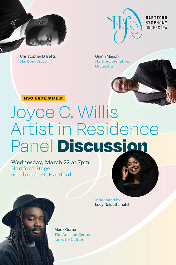
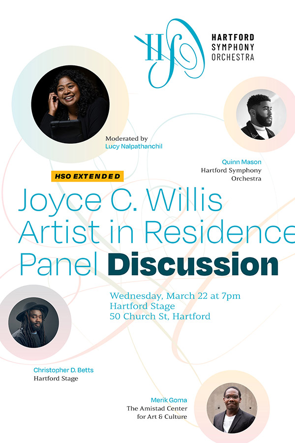
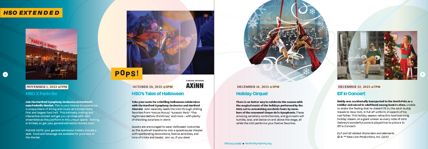
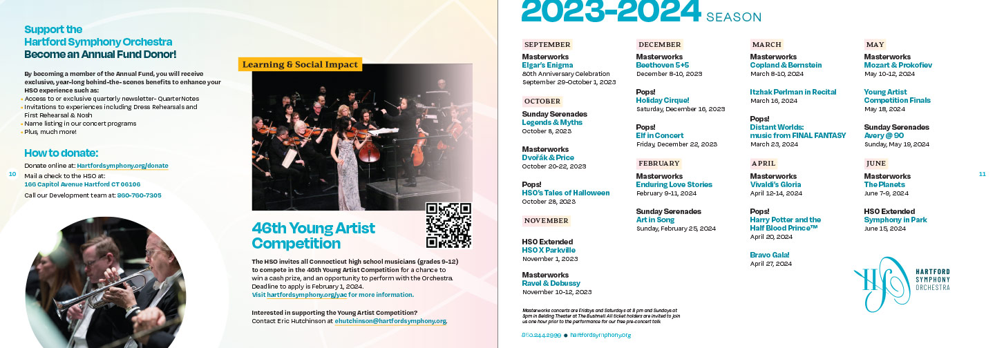
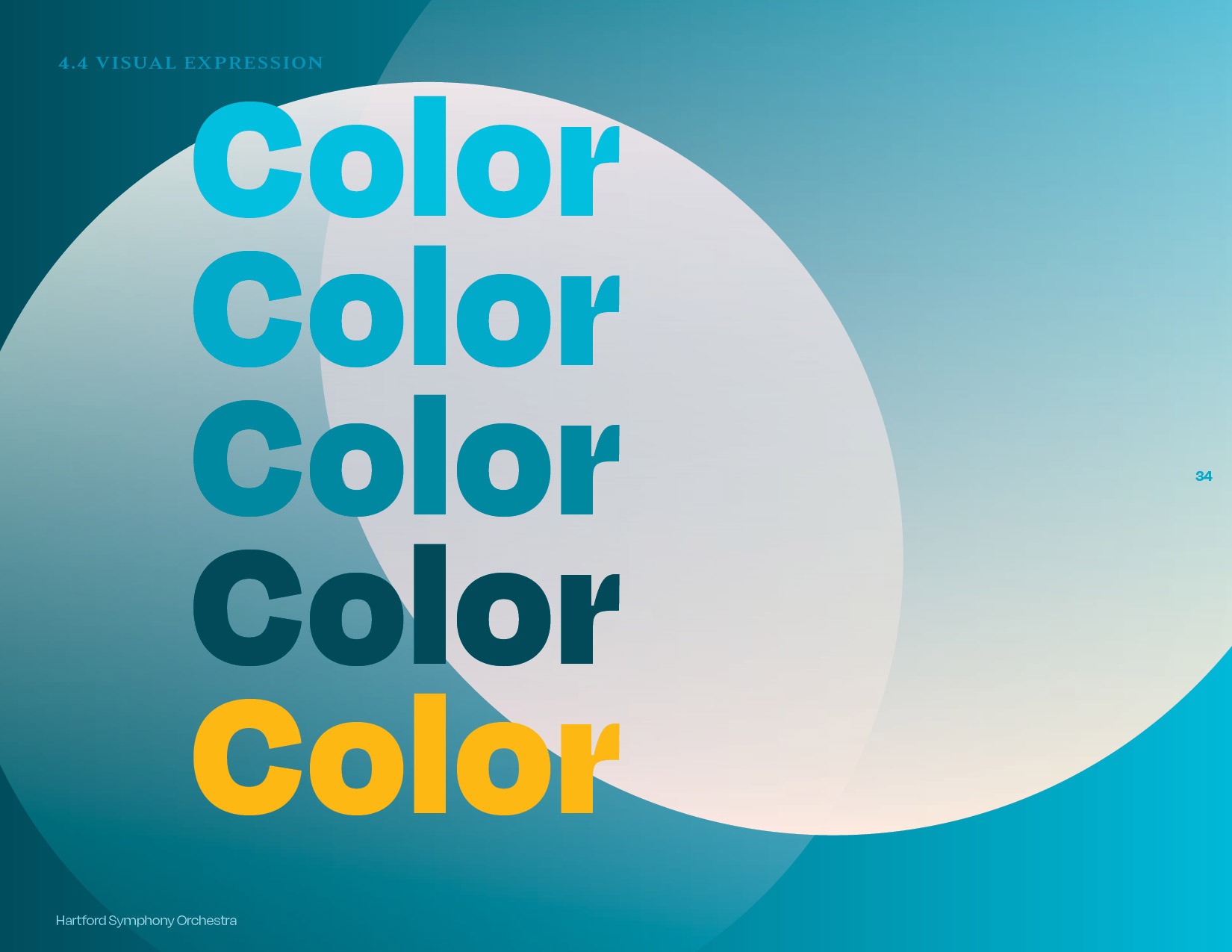
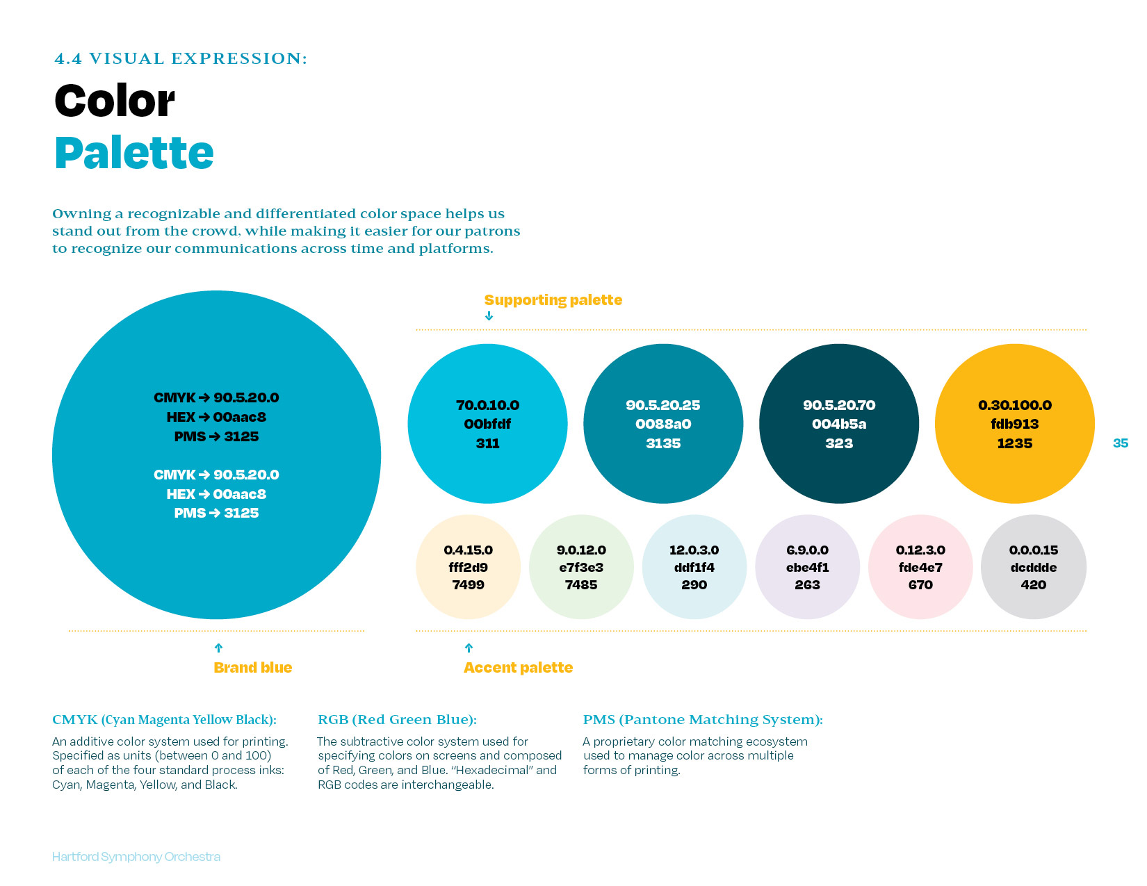
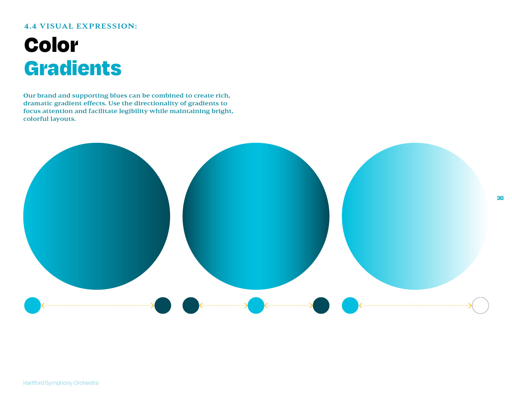
The Hartford (and larger regional) arts landscape is crowded with red-dominant arts and culture brands. The new brand shifts to a range of rich, energetic blues supported by an accent palette of delicate and sophisticated pastel hues.

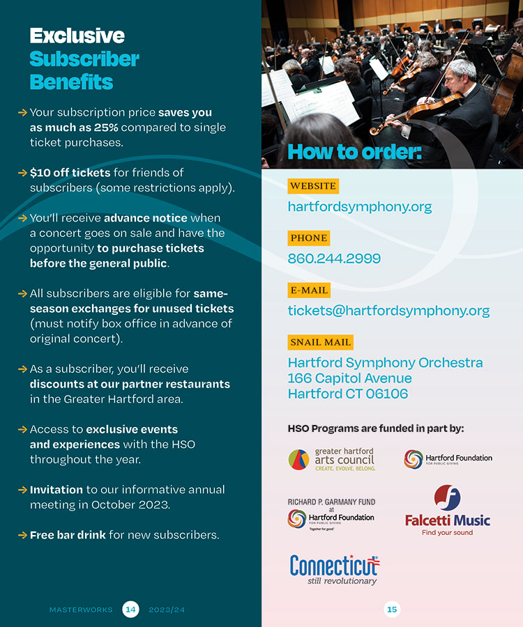
Putting the system into practice
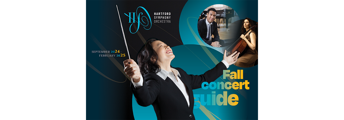
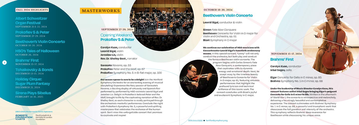
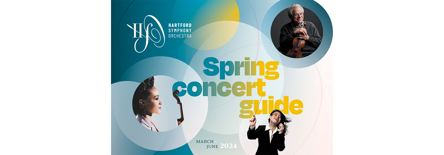
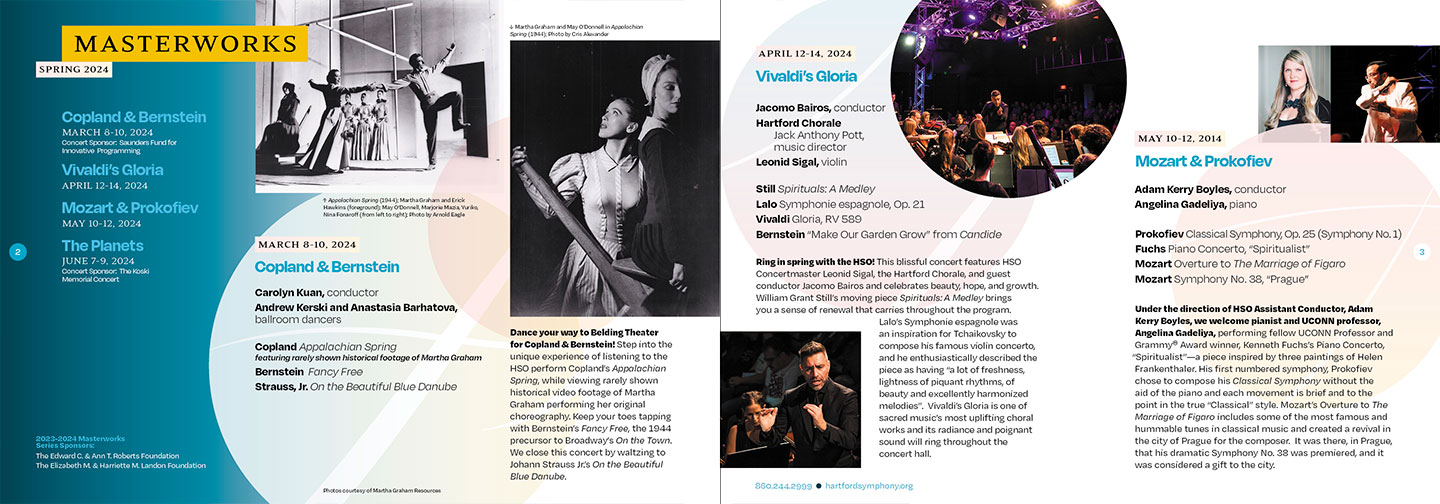
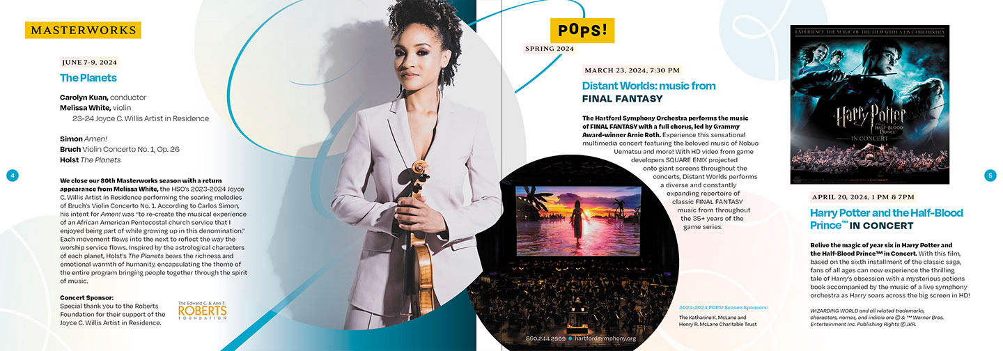
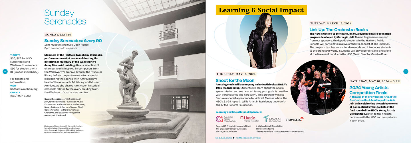
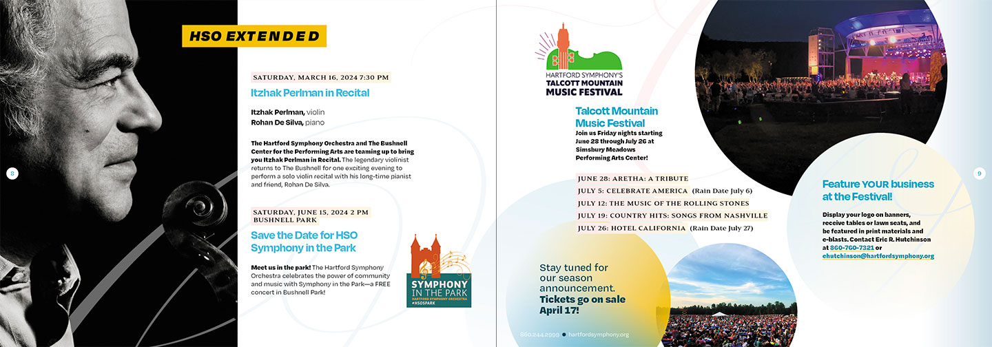
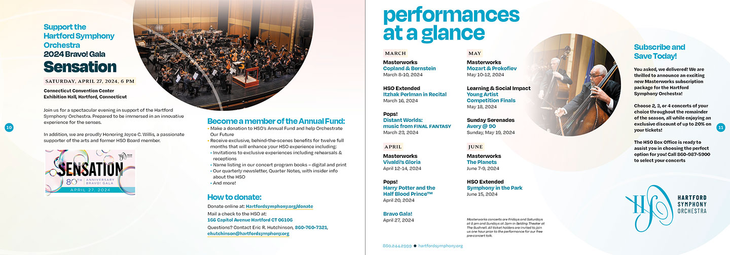
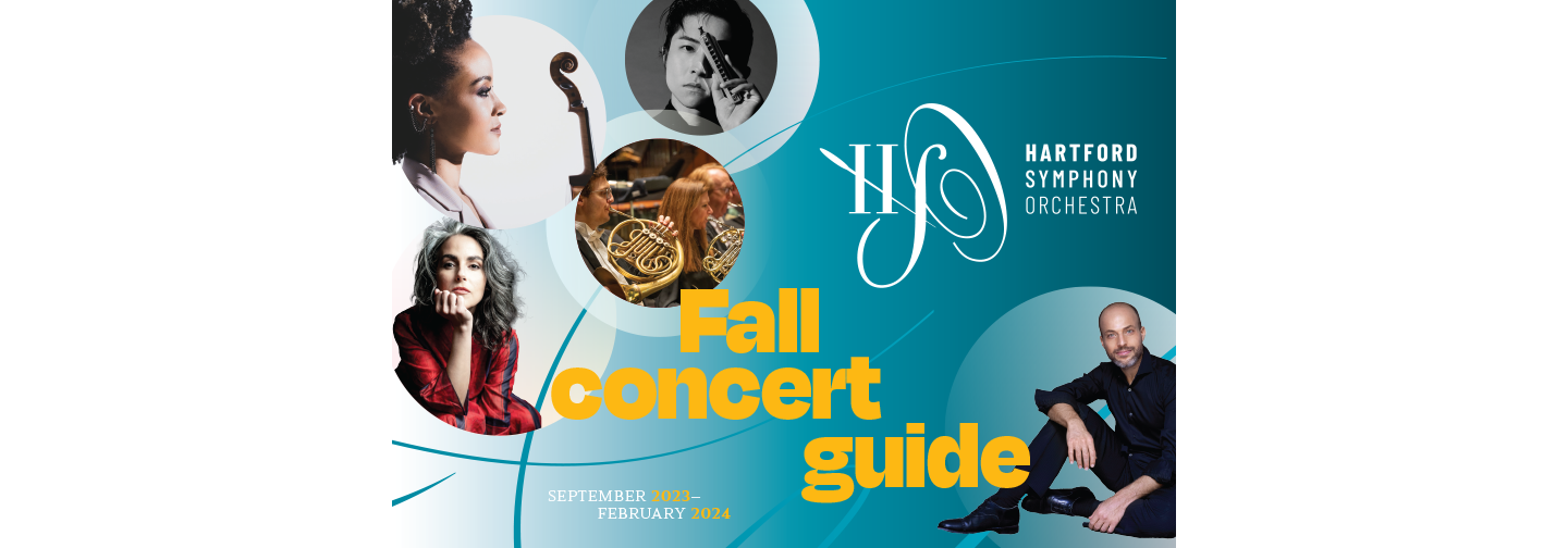
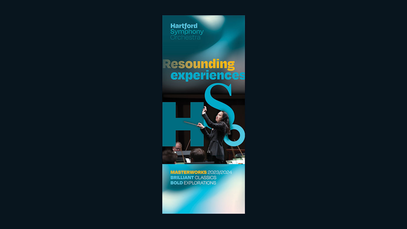
Seasonal concert guides
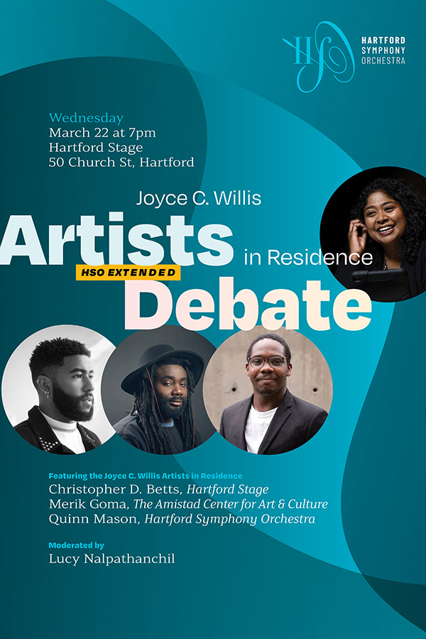
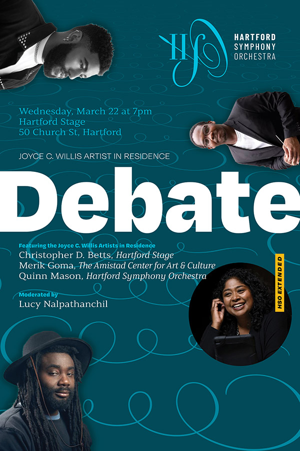
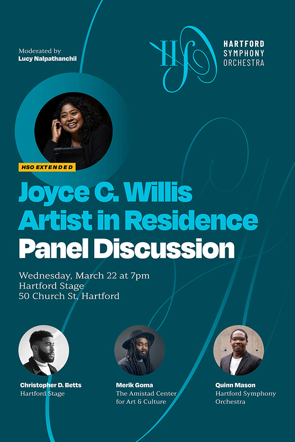
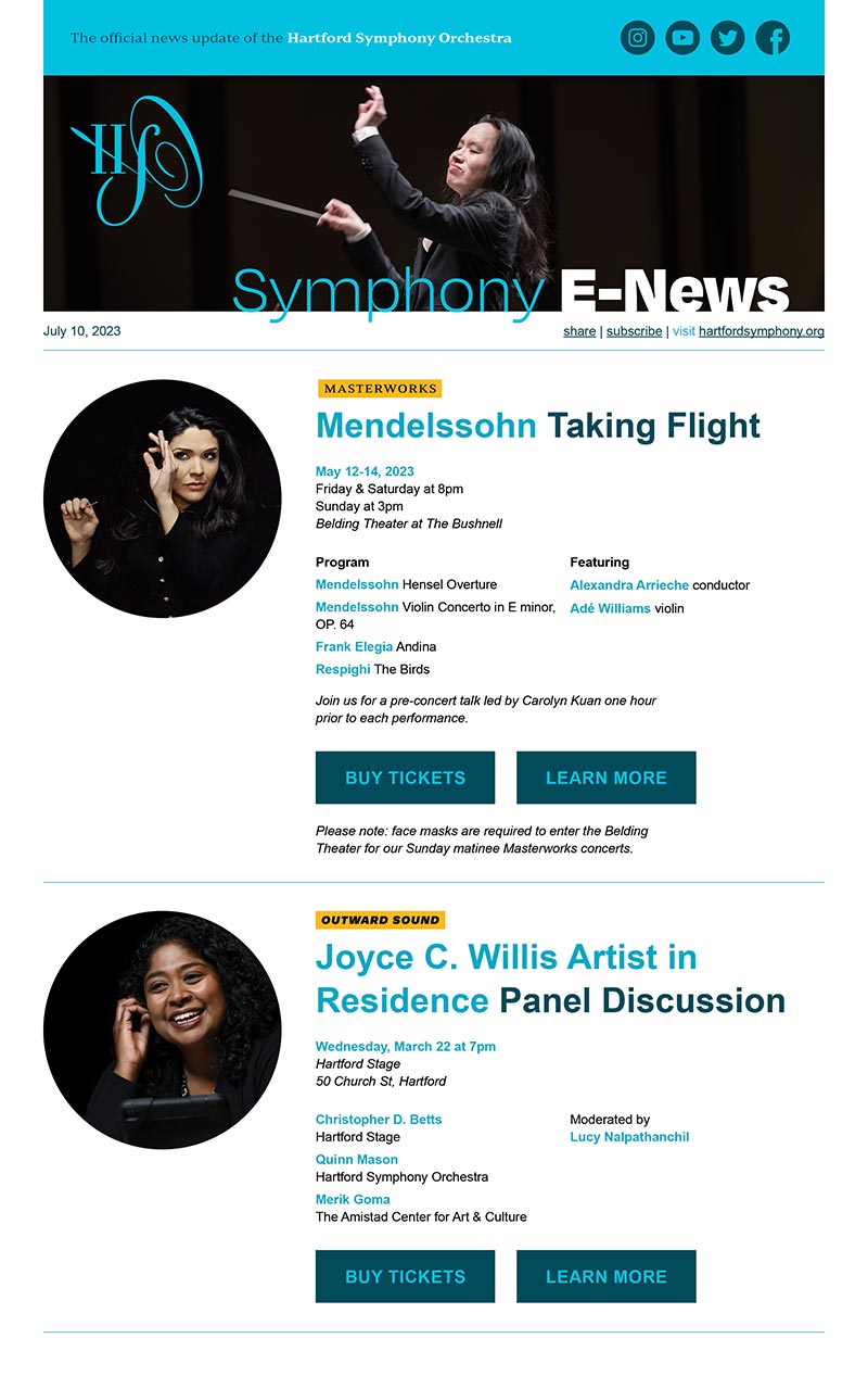
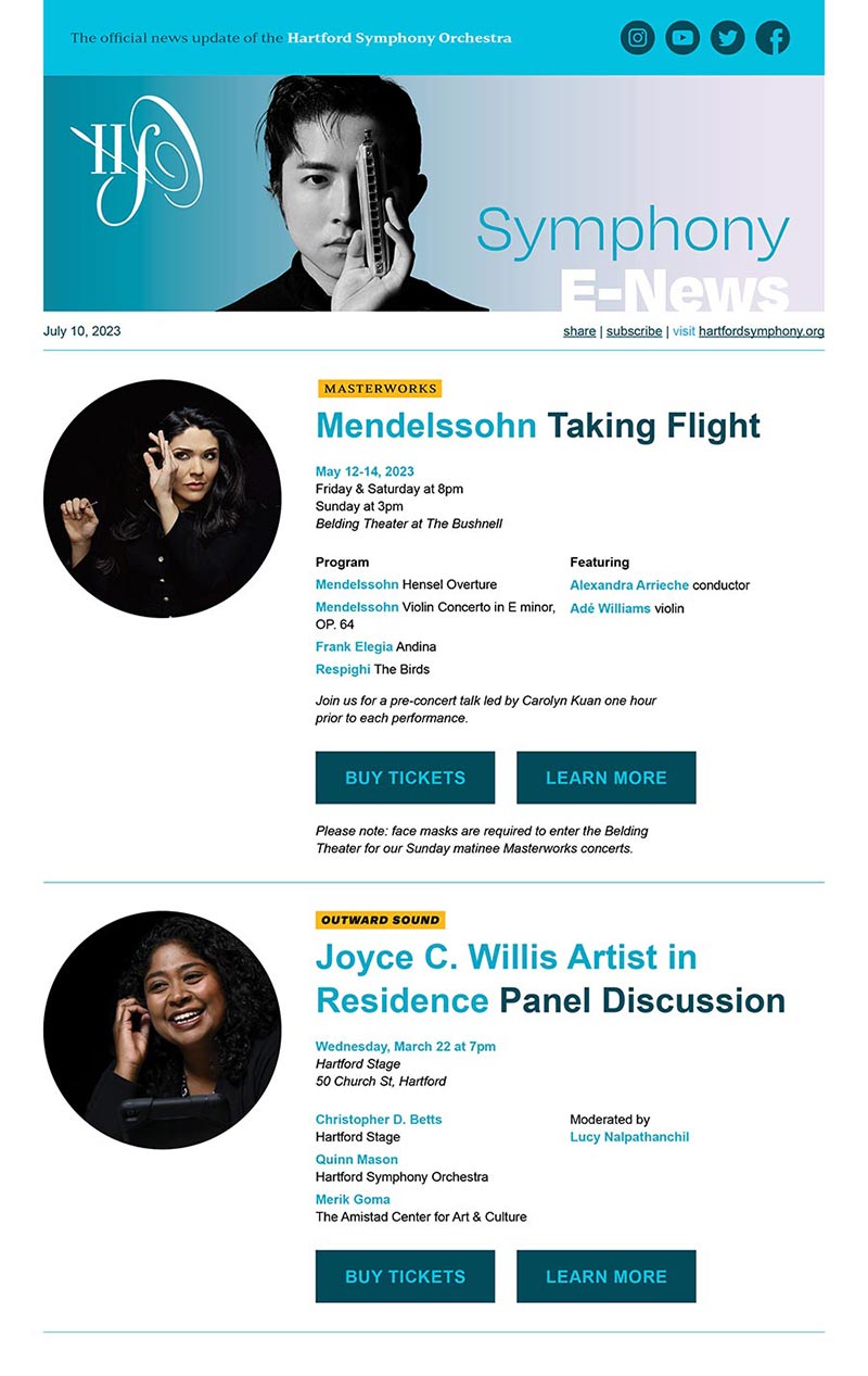
Fall and Spring concert guides replace season brochures, allowing for multiple contact points with audiences, a less overwhelming introduction to the season, and the potential for mid-season updates and announcements.
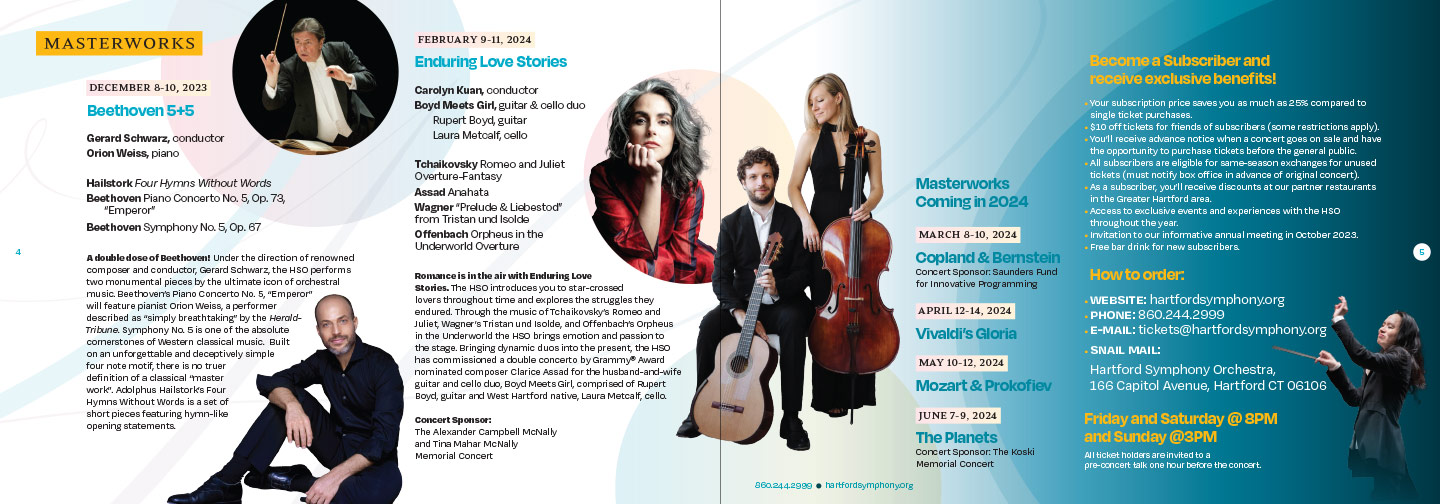
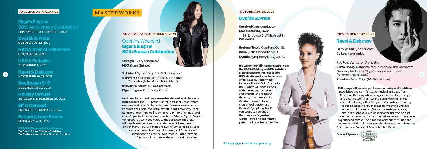
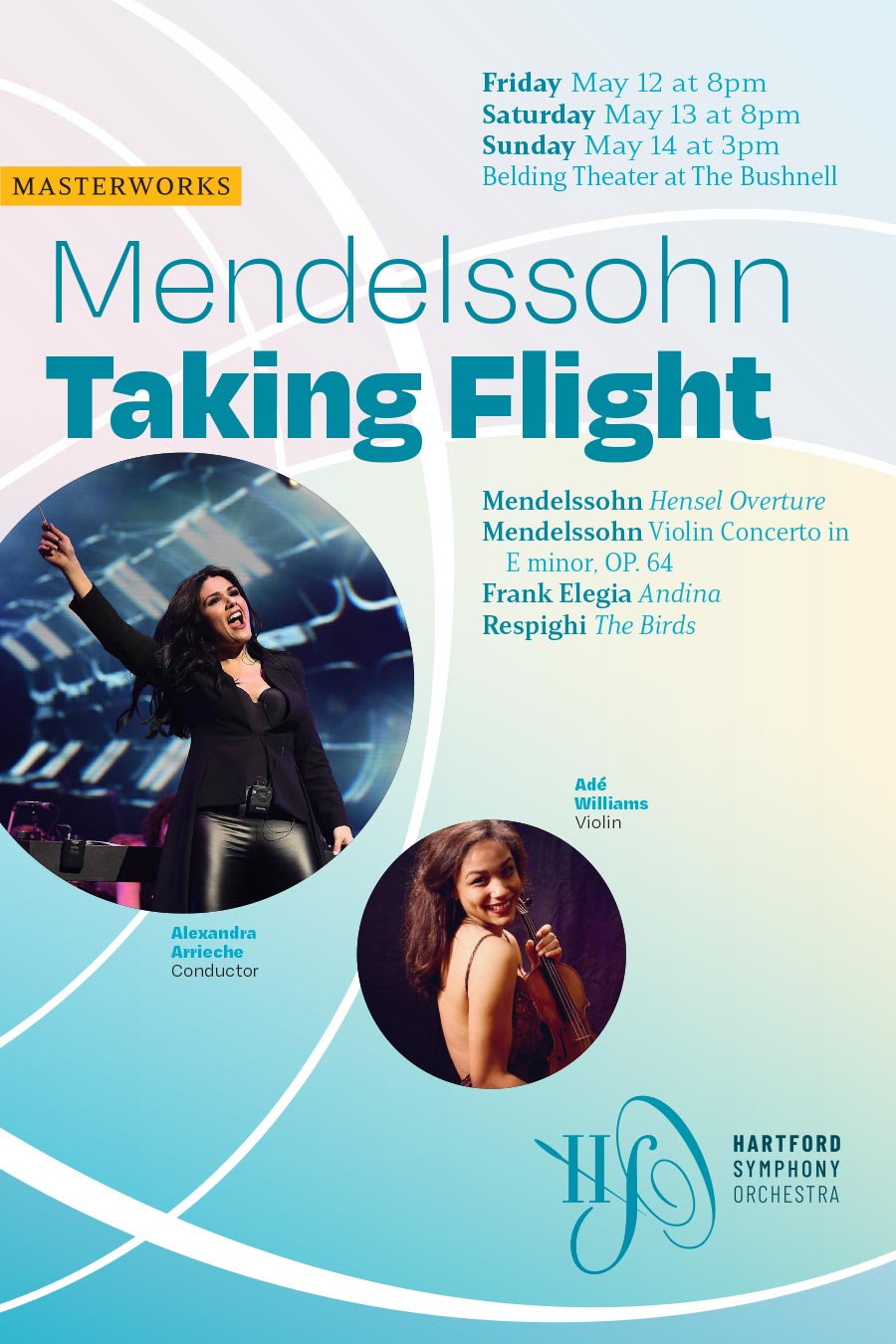
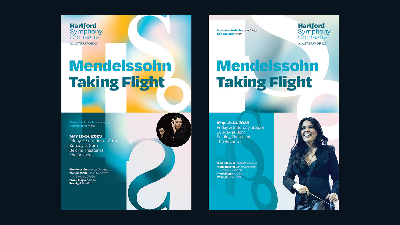
Mainly Masterworks
For the large audience of patrons concerned mainly with the Masterworks series, we developed a concise brochure promoting the complete season.


connecting the brand online
Web
Updated styles and simplified page structure brought the existing site into alignment witih the new brand.


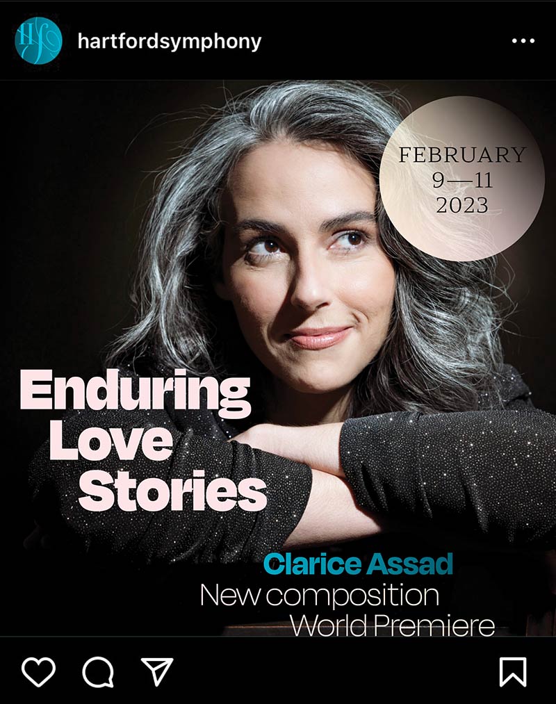
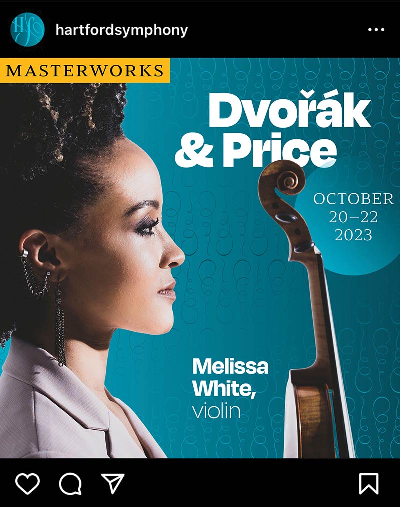
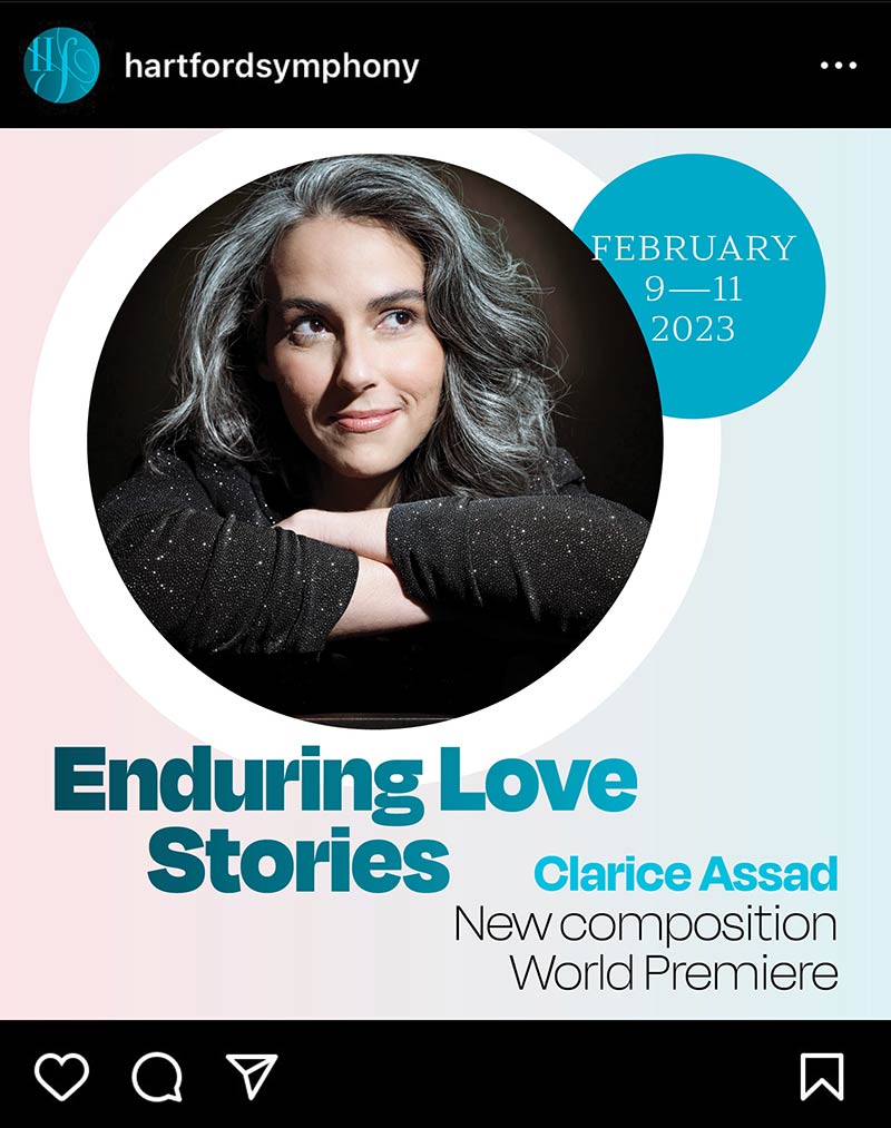
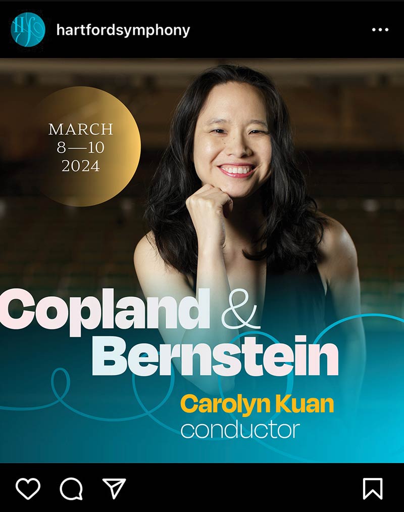
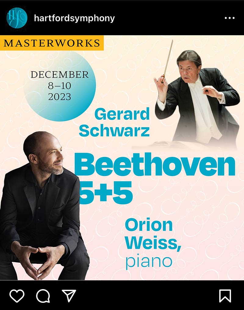
Social
The visual system easily extends to social platforms, creating an instantly recognizable aesthetic in patron's feeds.
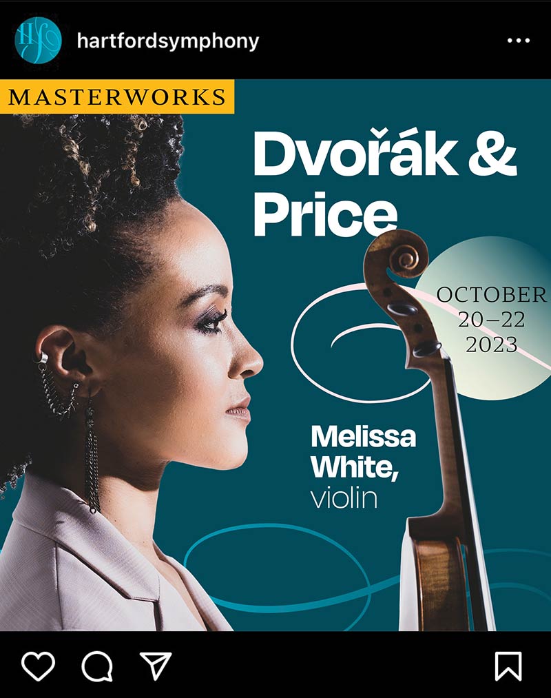
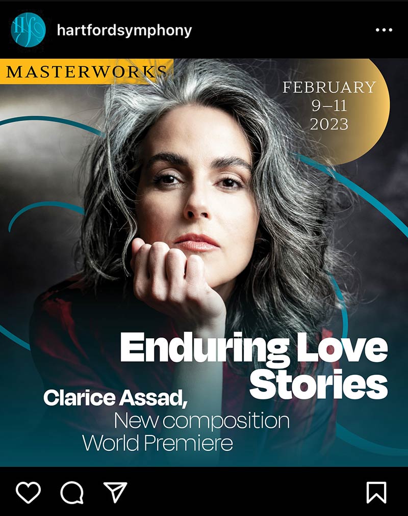
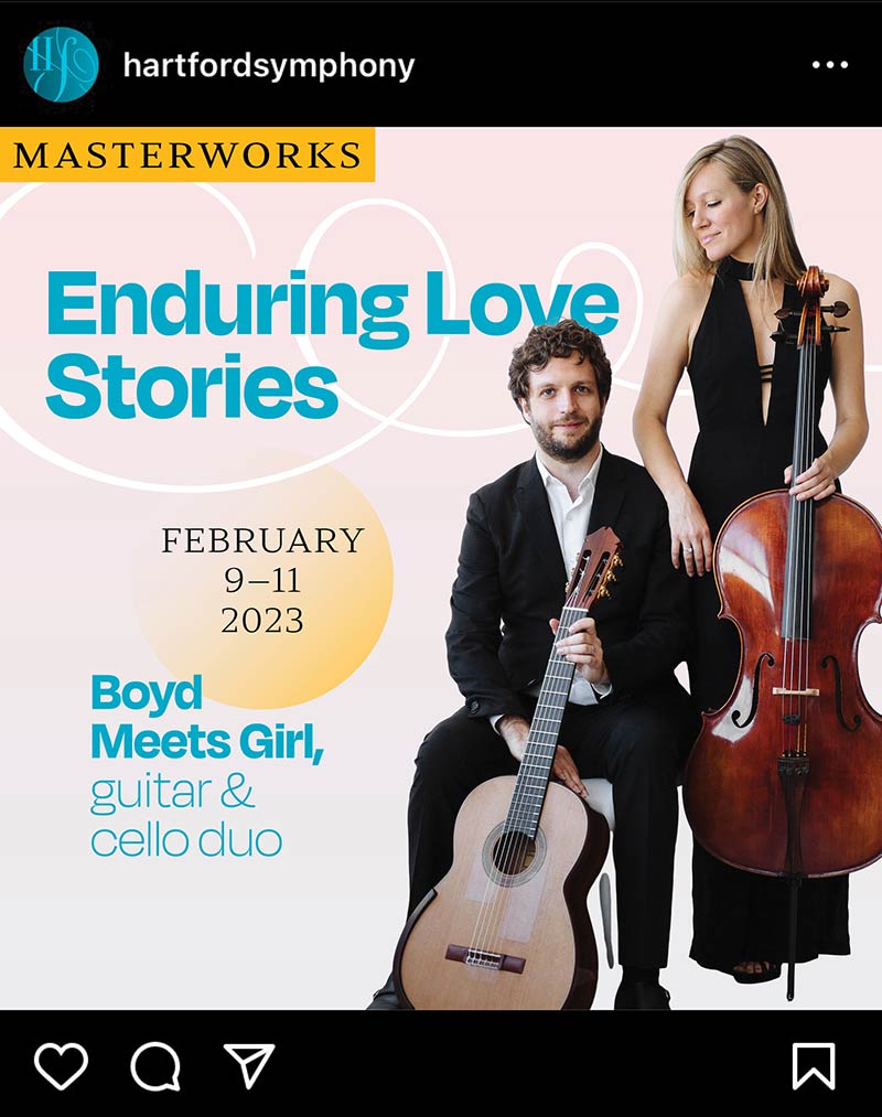
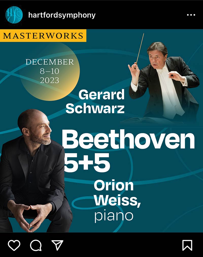
Templates reinforce print, social, and web-based communications.
documentation
Brand book
Comprehensive brand guidelines provide clear verbal and visual direction for future communications.
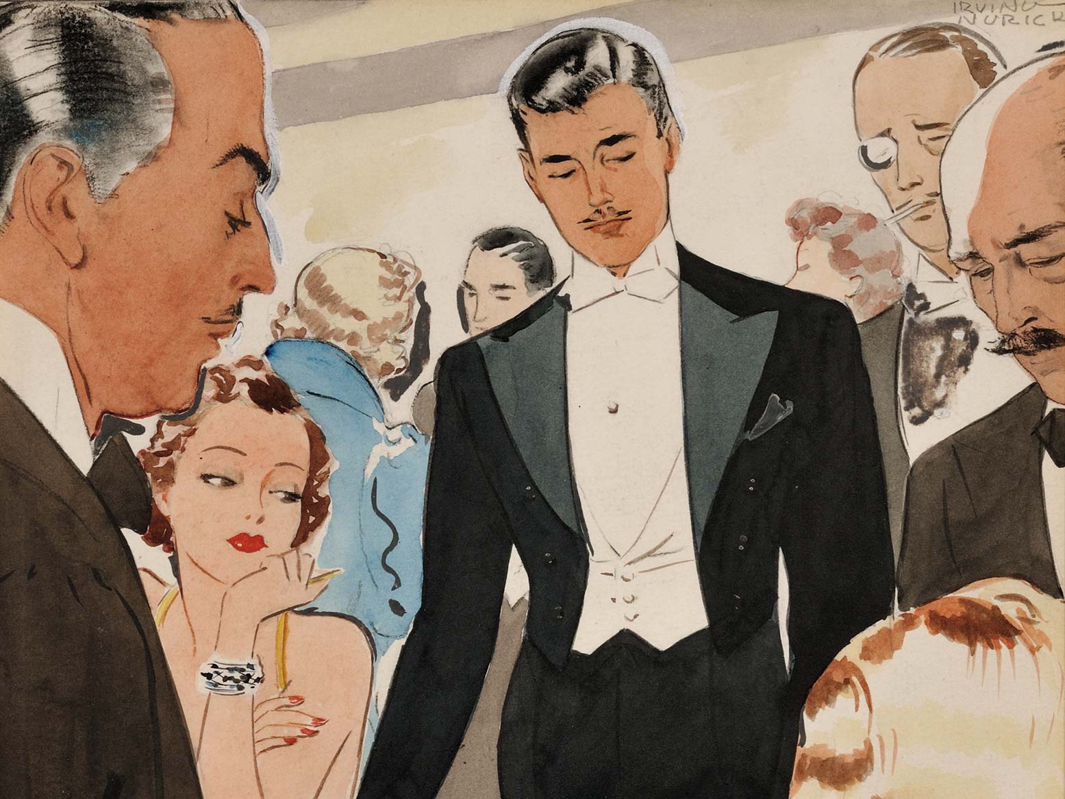
Exploration
A few snippets of alternate directions—both identity and visual system—we considered during the exploration process.

case studies


Contact
I’m an esthetically omnivorous, intellectually curious designer, photographer, creative director, and educator with over 25 years of agency experience, a deep focus in education, arts and culture, and financial services, and an affinity for typographic and photographic adventure.
All material © Alexander S. Budnitz and/or the orgianzations listed
